Good user interface (UI) design focuses on anticipating what users might need to do and ensuring that the interface has the necessary elements to facilitate those actions. Interface design is not art in the usual sense; it must be understandable and usable for the people interacting with it for it to be valuable.
User interface design can be an iterative process where experimenting with different techniques is sometimes necessary. It is not always a clean and linear process. Good web designers can certainly get close on their first draft of a UI element, but critical refinement can help make the UI as easy and satisfying as possible for site users. The most important aspect of that refinement process is to put yourself in the shoes of the user of the design. If you were the one using this page in the real world, what would you change on it to make it easier and more satisfying to use?
The easiest way to demonstrate what user interface design is, why it matters, and why you should invest in it is a step-by-step, before-and-after example where we start with an initial user interface design, and then tactically refine the design to make it easier for site users to understand and use. And, beyond making things easier for users, UI refinements like those mentioned below may seem small and inconsequential, but they can have a large impact on the performance of websites and web pages in terms of the results they produce for website owners.
TABLE OF CONTENTS
The Initial Design

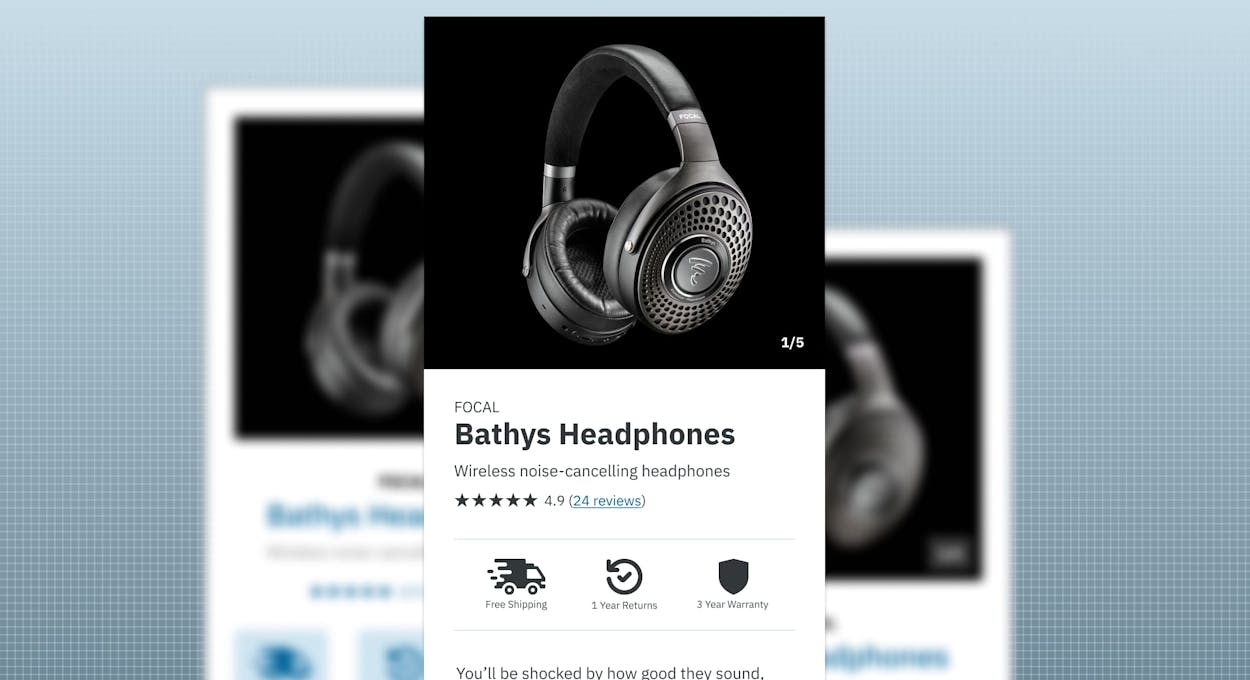
This is a mobile phone view of an ecommerce product interface for a pair of headphones. It has the necessary elements you would expect it to have, like the product’s name, review stars, some highlighted aspects of the product and the purchase process, a product description, a price, and of course an Add to Cart button. This layout is “okay,” but it can certainly be improved. Let’s see how.
Text Alignment

Left-aligned text is widely recognized as optimal for readability, particularly in languages written from left to right like English. This principle is firmly established in design practices. Our first step will be to change the centered text on the initial design to instead be left-aligned. This adjustment prioritizes clarity and ease of reading, helping users quickly absorb the content without unnecessary strain or confusion. By adhering to this established typographic convention, we make reading the content of this product page easier for the user.
Consistent Spacing

The original design's spacing is somewhat random and inconsistent. To enhance readability, we'll apply a more uniform spacing scheme, which will help define the various sections of the interface better visually. By employing just two different vertical spacing heights, we aim to create a better-organized layout that is easier for users to navigate and comprehend at a glance.
Treating Similar Elements Similarly

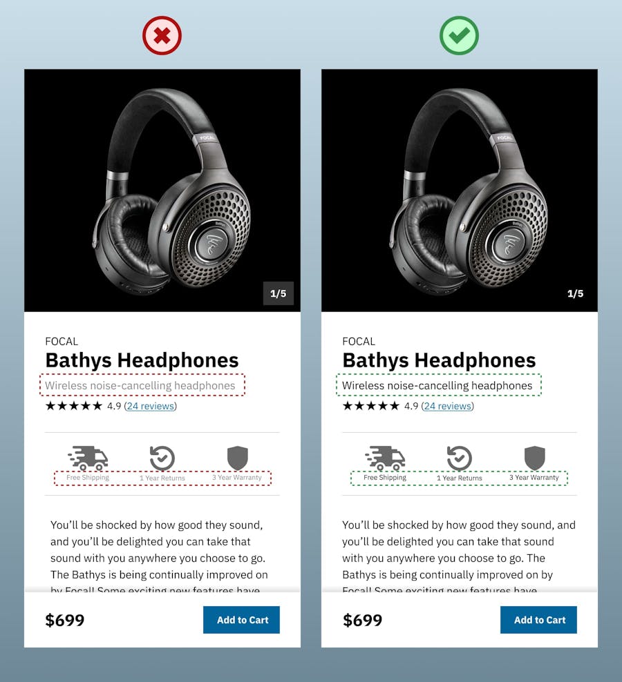
When giving the design so far the trusty “squint test,” it becomes apparent that the area with the three larger icons is dominating the design a bit, and drawing attention away from the Add to Cart button. Let’s fix that.

The icons for Free Shipping, Returns, and Warranty are certainly worth having here in the design, but they are competing a bit with the Add to Cart button in terms of their size (which is a proxy for their relative importance to other elements on the page) and their shape. The containers on the icons look quite like a button shape. Since the icons’ containers look a lot like a button, people might wonder if they are clickable (which they are not, by the way). So, we are going to refactor the icon area a bit to help make it clearer to users those are elements of the page to look at and read but not interact with, whereas the Add to Cart button is an interactive element.
Tactical Use of Colors
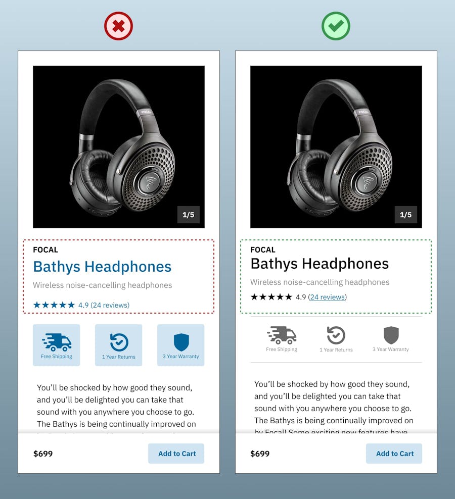
Another area of potential user confusion is the blue text color used on the product heading and on the stars near the review link. We are making it fairly clear on this design that blue means “interact with me!” because that is the color the Add to Cart button is using. However, I would bet people will try to click on that heading and stars too if we were to leave them this as-is, so we are going to change them to the normal text color since that is just content for site users to look at and read, but not interact with.
Underlining the “24 reviews” text link is a good idea here too, just to double down in terms of make it clear that it is a text link that users can click on if they’d like to.
That Add to Cart button is still not doing its job as well as it could here. Let’s make it even more obvious that it’s there and interactable by upping the contrast of the button compared to the rest of the page.
Upping the font size of the price in the bottom left seems like a good idea here too since that is a very important piece of the puzzle here to encourage purchase of this product, and we want to make sure the user knows what this product costs.

Much better.
Does your website have any opportunities for refinement?
If you'd like to chat about what UI refinements may exist on your website or web application, give us a shout.
Contact ValiticsOkay, now for another squint test.

Even with these relatively simple and quick changes so far, the design is already feeling more tailored to how users will likely interact with it, and how this website’s owner presumably wants the users to interact with it in terms of adding this product to the cart.
Removing Unnecessary Styling

A smart guy once said “simplicity is the ultimate sophistication.” It tends to ring true in most situations, and it can certainly apply to this design as well. Here’s how:
- Removing the white frame around the product image gives the product image more visual prominence and impact.
- Removing the container around the “1/5” image pagination will help draw more attention to the product image itself. It should also be noted that, if/when the image behind this 1/5 pagination has a light or white background, we would add a black, semitransparent background container or text shadow behind that 1/5 text so that it will remain legible over light/white backgrounds too.
- Removing the border around the frame of the card itself removes one more potential distracting element that makes the design feel unnecessarily cluttered and unpolished.
- Removing the roundedness on the button (which is called border-radius in the web design world) will square off the button. This simplification helps the design feels a little more consistent with the squared edges of the larger container and the square product image section.
Visual Hierarchy of Text

When choosing the fonts and font-weights used in a design like this, it is important to apply them in ways that make the visual hierarchy of the interface clear and obvious to users. In the original design, the brand name of Focal and the name of Bathys Headphones below it feel somewhat equally important and thus more likely to dilute each other when people are scanning this design quickly on their phones. Deemphasizing the brand name just a bit with a lighter weight and emphasizing the product name with a heavier font weight makes it more obvious to site users exactly what product they are viewing.
Color Contrast of Text
If you do web design long enough, you get pretty good at identifying what color contrasts people are going to have a hard time reading. We certainly have some problematic contrast areas here in our original design. Namely, the light gray on the “Wireless noise-cancelling headphones” sub-heading and on the icons’ descriptive text. Simply changing that light gray text to black makes it a lot easier to read, which is obviously a good thing.
Staying Away from True Black
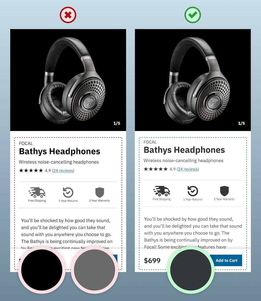
This particular refinement is less of a hard-and-fast rule and more of a preference we have at Valitics. The original design still has the original text color of true black (which is #00000 if you speak hex color codes) along with an additional lighter gray color for the icons (since they felt way too heavy as true black in the initial design). So, we are going to change the text and icon colors to a single dark gray color (#323739) that actually has some blue in it as well. Since blue is a brand color here in our design, we infuse just a tiny bit of that blue in our dark gray used on the text and icon color.
This subtle use of a dark blue/gray instead of true black may not registered explicitly in the minds of users, but it tends to feel more refined which helps users move on to thinking about buying the product faster since they don’t need to start questioning if this site is trustworthy or not based on something feeling “off” with the look of the page.
Before and After

That should pretty much do it. We have put ourselves in the shoes of a site user and tried to anticipate what they might need to do on this page and anything that could get in the way of that. With these relatively simple UI refinements, we have improved the clarity and intention of this page, which should help users learn about and buy the product faster and easier. That is what user interface design is all about!