
Tesler's Law is centered around the concept that every human-computer interaction (such as using a website) has an inherent amount of complexity that cannot be removed or hidden. That remaining complexity must be absorbed by someone, either the person who made the website or the person using the website. At a certain point, things cannot get any simpler, and the remaining complexities involved must fall on someone to deal with.
Real World Examples
To help exemplify this concept, let’s first apply it to some real-world situations. Here are a few examples from our everyday lives where Tesler’s Law reveals itself, and who is left to deal with the remaining complexities.

Pricing stickers
We’ve all tried to cleanly remove a price sticker from a product only to find yourself in a battle with the sticker. Usually, you are left with a good amount of adhesive still smeared on the product, about a dozen little pieces of tacky paper balls, and sticky fingers. The manufacturers of those stickers have basically said “good enough” and have left it to the consumers to grapple with removing these stickers cleanly.

Motion-sensing soap dispensers
You’ve been at the movies or out to dinner and have run into one of these monsters. Sometimes it works as expected and a single swipe of the hand gets you what you need. More often than not though, you end up finding yourself practicing your own special brand of frustrated karate in front of one of these devices and cursing whoever made the thing.
Clamshell packaging
Wrap rage is real. We’ve all experienced it. Your brute strength tactic will eventually fade, so then you start looking for weak points in the packaging, and then the search for scissors/knife/screwdriver ensues, and so on until a small opening forms that you tear into like a honey badger. There has to be a better way, right? Undoubtedly. But manufacturers have chosen to let customers basically just deal with this nightmare so that they can save some money during the manufacturing process and increase some security while the products hang in the store.
Too much complexity? We are here to help.
Please, reach out to us to discuss how our team can help you simplify your website operations.
Contact ValiticsTesler’s Law and Web Design & Development
Okay, my mini rant about this sort of annoying, everyday stuff is over. Back to how Tesler’s Law applies to the websites we use every day. As a digital agency, we spend a lot of time thinking about how we can absorb as much of the complexity involved with users interacting with the sites we build and maintain for clients, so that site users don’t have to.
For the purposes of this article, we will use an example of a simple form on a website.
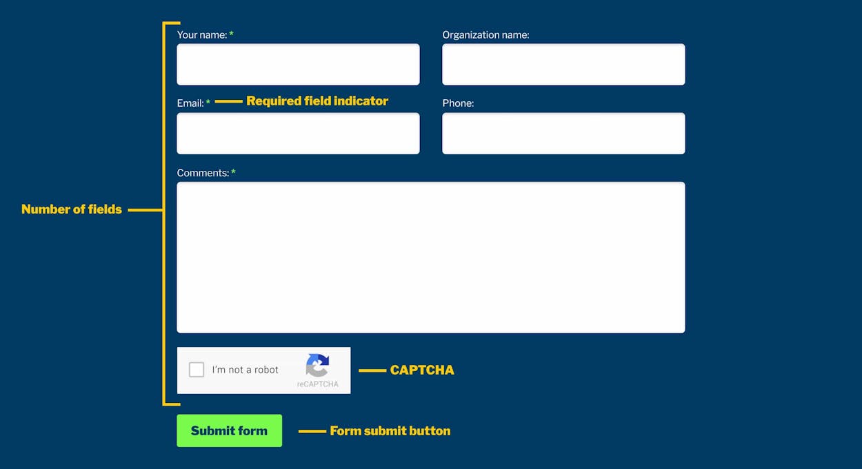
Nothing fancy here – it’s a few fields, a CAPTCHA, and a button. The goal of a form like this is to collect user information for the purposes of using that information in the future, usually to contact the user as a lead for the owner of the website and web form. That all makes sense, but let’s analyze this form’s pieces through the lens of Tesler’s Law.
Number of form fields
The first example of Tesler’s Law at play here is the number of fields and what information they are asking for. Complexity for the user could be reduced by decreasing the number of fields on this web form. And, on the flip side in this case, the complexity for the owner of the website would then increase since they’d have less information about the user when certain form fields are removed.
Is the “Your Message” field necessary here? If not, the site owner should think about removing it. If it is necessary, then that complexity of viewing it, deciding to fill it out, thinking about what to type into it, and typing the response to it into the field all stays on the side of the user. We have this basic conversation with our clients frequently – are the fields in a form really all necessary, or just “nice to have” to make things easier for the salesperson who will receive it? It’s a truism in our industry that the number of fields on a form has an inverse correlation to how likely it is that a user will complete and submit the form. We generally like to guide clients to streamline their forms as much as possible, which makes it more likely that users will fill the form out.
Once the fields are trimmed down to the absolute minimum number of fields required to get what is needed, we move on to how we can make that form and its number of fields as easy as possible to fill out. That endeavor includes activities such as:
- Ensuring form field labels stay visible when being used
- Ensuring form field labels are descriptive and clear
- Adding an active state on a field so it is obvious what field you are typing in
- Ensuring form fields can be tabbed through with your keyboard. This is an accessibility aspect in addition to a general form best practice
All of these aspects are aimed at shifting that complexity of trying to understand the form fields off of the user and onto the site owner who set up and published the form.
Required Fields
The form in our example assumes that users know that field names with a * on them denotes a required field. Some fields are required and other fields are not required on this form, and that difference adds complexity for the user. As we said at the beginning of the article, at a certain point there is complexity that cannot be removed, but rather must be dealt with by the user or the creator of the form in this case. For this form, yes it is assumed that the user would know what the * means on these fields, but other ways this required/not required dichotomy can be made simpler for the user is to:
- Adding information that explains what the * on the form indicates
- Creating informative field reminders when the form is submitted without the required fields being submitted
Again, these form field enhancements are aimed at shifting that complexity of trying to understand the different types of form fields off of the user and onto the site owner.
CAPTCHAs
I don’t know about you, but I am tired of having to prove I am not a robot every day of my life. Putting aside my opinions of the people who create spam bots that troll the internet and submit gibberish into web forms, this CAPTCHA process is another example of Tesler’s Law at work. These CAPTCHAs exist to curb spam form submissions and ensure that forms that are submitted are authentic. But, they put the onus of dealing with the complexities involved in this CAPTCHA process primarily onto the web form user. Alternatives that would make it easier for users to fill out this form and shift that complexity back to the site owner would be to:
- Use a more modern and simple-for-users method (such as ReCAPTCHA) that helps website owners detect abusive traffic on the website without user interaction. Instead of showing a CAPTCHA challenge, reCAPTCHA v3 returns a score so the site owner can choose the most appropriate action for that submission
- Use a simple question that people can answer versus trying to find pictures of buses, bicycles, crosswalks, etc. Answering the question still adds complexity to the process, but arguably less complexity than the CAPTCHA does
-
Simply remove the CAPTCHA requirement altogether (which is obviously easier for the user) and instead focus attention on tricking the spam bot to identify when a form submission is spam. There are a couple ways this can be done:
- Honeypot – this involves adding a hidden field that users cannot see but spam bots can, and they will likely fill out that hidden field, at which point that submission can safely be marked as spam
- Time-based forms – this involves timing how long it takes a user to fill out a form. People take some time to fill out a form, whereas a spam bot will generally fill out the form fields nearly instantly. When you see a form submission that took less than say 1 second, it is safe to assume the submission came from a spam bot.
Recap
There are lots of more complex examples of Tesler’s Law at play on the websites you use every day (think about the ecommerce checkout process, doing Google searches, trying to book a flight and hotel online, etc.), but even in our example of a simple web form, serious consideration should be given to how the site owner can make interacting with their website as simple as possible for their site users.
Custom Websites versus Pre-Built Solutions
In our experience third-party tools, frameworks, and pre-built templates tend to gloss over some of these types of incremental but nonetheless important improvements that can make things easier for site users. It is too easy to assume that whoever made those prebuilt tools thought about all these types of aspects so you don’t have to. That can be dangerous. It’s not always the case and “setting and forgetting” these types of one-size-fits-all tools often means that the usability of a website is not as optimal as it otherwise could be.
It takes time, effort, and expertise to think about the ways a website can be easier for users, and then to actually implement them. That is a key role for digital agencies like Valitics when building and maintaining client websites – to look out for our clients’ websites and ensure that they are set up as efficiently and effectively as possible for site users to do what they want to do on the website.